My work at Emplate
As Co-Founder and partly responsible for the tech stuff at Emplate, I’ve been at the center of the initial design and development of the Emplate platform and services, and is continually doing the best I can along with Søren Gregersen at Emplate to build the best features we can.
So far, we’ve built a bunch of stuff that I’m proud of. Here is some of the stuff we’ve built:
Beacon Management System, version 1
The Emplate dashboard, beacon management and platform was initially built using Laravel 4 (then 5.0, 5.1 and 5.2), which is depicted below. The mobile clients fetched content and posted analytics data using an API that was specifically designed for our initial clients and use case. An example of the majestic monolith serving mobile apps and the administrative frontend. It was a design pattern which was a good fit for our developer team, which just consisted of the 2 technical founders.

The content was created in the editor to the left, and sent to the clients.
Overview and Editor
The initial design was based around the organization having a few beacons, and some posts to show. This approach with large boxes and a three-column layout didn’t scale well with lots of content and beacons (herningCentret have about 50 beacons deployed at the time of writing).
This was later remidied in the angular application. I will be sure to publish some of the more interesting details at some point when we’ve iterated on the initial user feedback.
The editor was designed using the drag-n-drop paradigm as well, and reused some of the visual cues from the overview. The mobile preview was part of the original design mockups, and have remained ever since. The original idea was to make it as accurate to the iPhone screen size as possible. This has unfortunately become less feasible given the multitude of sizes that Apple now use - and we haven’t even touched upon the Android marketplace.
It was therefore decided that other features were more useful at the moment, and a close approximation seems to work nicely for our customers.
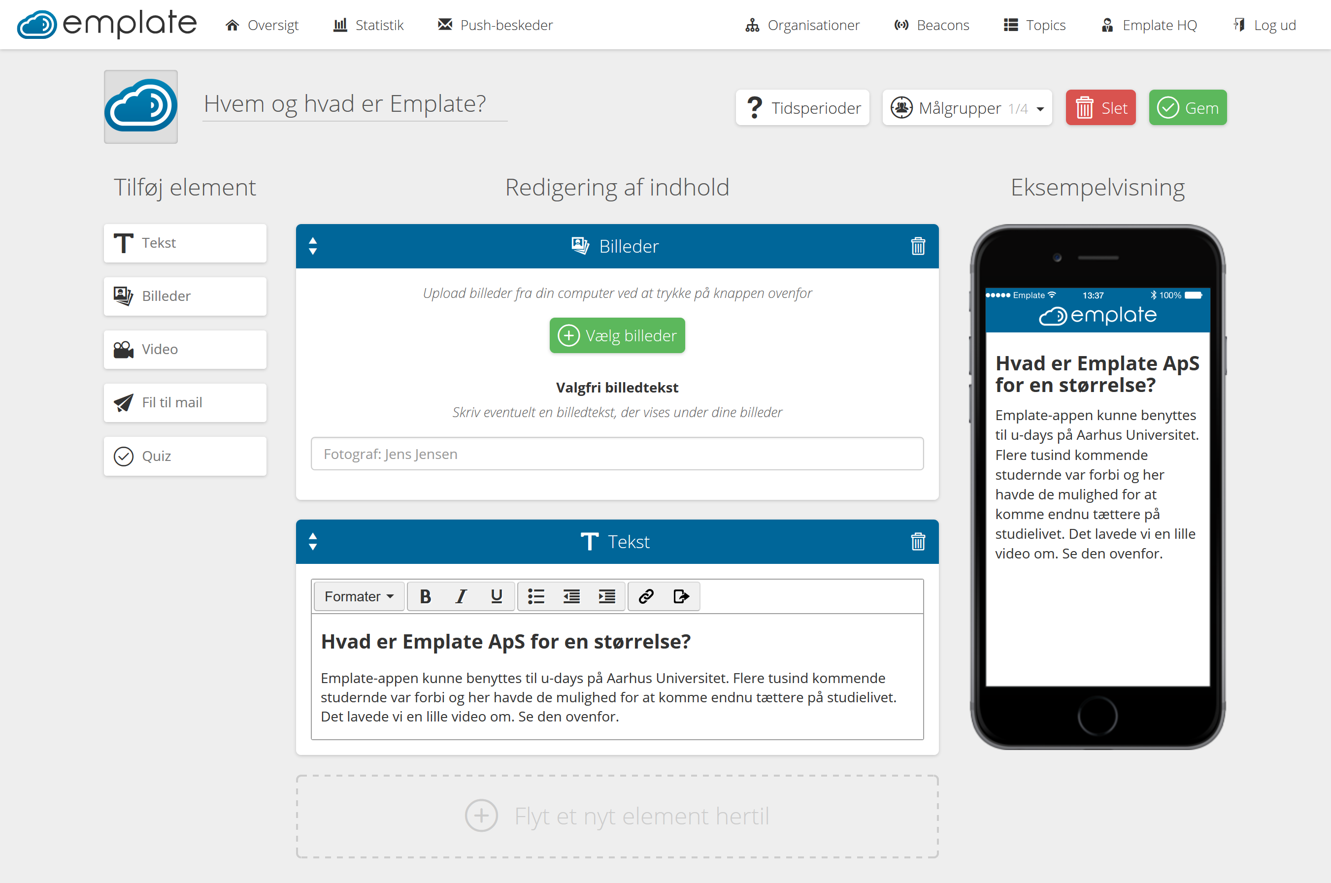
The editor, with the mobile preview on the right.
The Editor was implemented using the blade templating language of laravel, along with a lot of jquery-ui elements. The editor was one the first asynchronous screens we created, as much of the interaction we wanted to achieve in order to create a fluid and powerful content creation experience.
The initial design paradigm of “elements” of different types has served us well so far. The monolith makes it easy to implement a new type in the editor and backend, while also implementing the mobile view that is to be served to the mobile clients. Having this consolidated into one location makes it easy to reuse code between the preview and the actual webviews served to the client.
The next post will include some of the work we’ve done on the mobile clients, along with the next version of the dashboard (in Angular).
See you around!